Helvetica
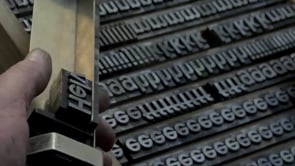
A single typeface, everywhere: subway signs, tax forms, American Apparel logos, government paperwork, corporate branding. Gary Hustwit's film traces how Helvetica, designed in Switzerland in 1957 by Max Miedinger, became the default typeface of modern life, and lets the people who love and hate it argue it out on camera. Massimo Vignelli explains why he thinks it is close to a perfect form, while designers from the grunge and punk scenes, including Experimental Jetset and David Carson, make the case that its neutrality is really an ideology, one that erases the designer's hand and serves institutional power. Interviews run alongside close, patient shots of the letterforms themselves, comparing Helvetica's straight terminals and even weight against older faces like Akzidenz-Grotesk. The film moves from Swiss modernist print shops to New York City subway signage to contemporary graphic design studios, building an argument about how a piece of typography can carry political and aesthetic weight without most people ever noticing it is there.